
Case Study 2026
Zeerka (Full case study in progress)
Redesigning a cross-browser start page and bookmark management experience.
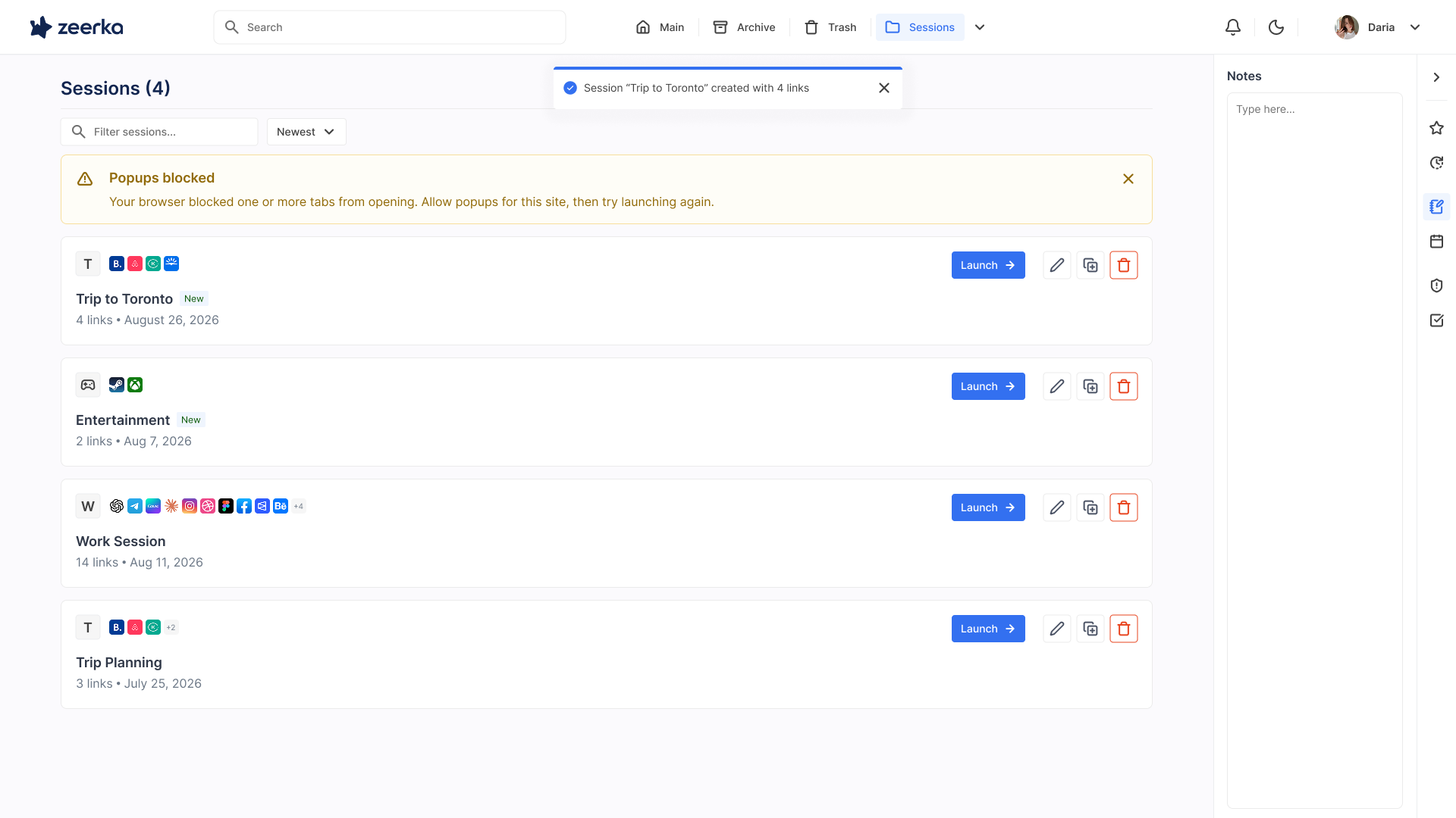
Zeerka
01
Outcome
Product:
- Introduced a customizable start page with a calmer entry into Zeerka.
- Simplified core workflows across links, groups, tabs and sessions.
- Created clearer patterns for shared activity, notifications and feature availability.
Business:
- Introduced calendar functionality as a premium-plan concept.
- Created clearer locked and unavailable states for plan-gated features, making upgrade boundaries easier to understand.
- Strengthened Family and Company use cases through shared flows and a connected notification system.
02
Introducing a dedicated start page
Previously, Zeerka opened straight into the full bookmark workspace. I introduced a separate, customizable start page that gives users a calmer entry point, while keeping the full workspace easy to access.
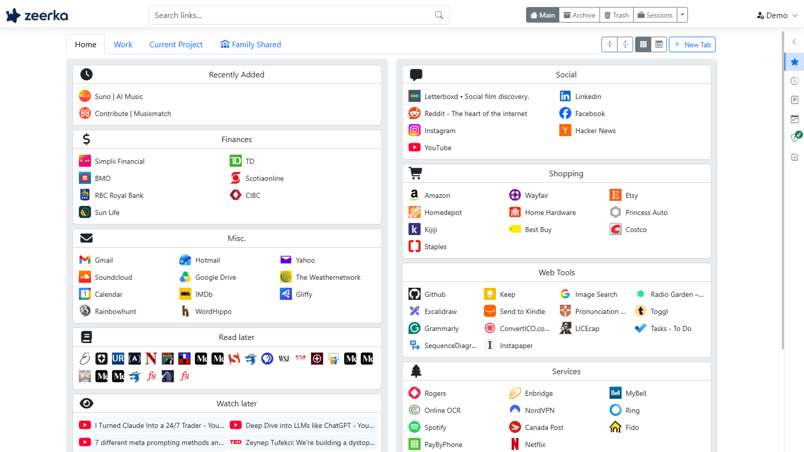
Old start page
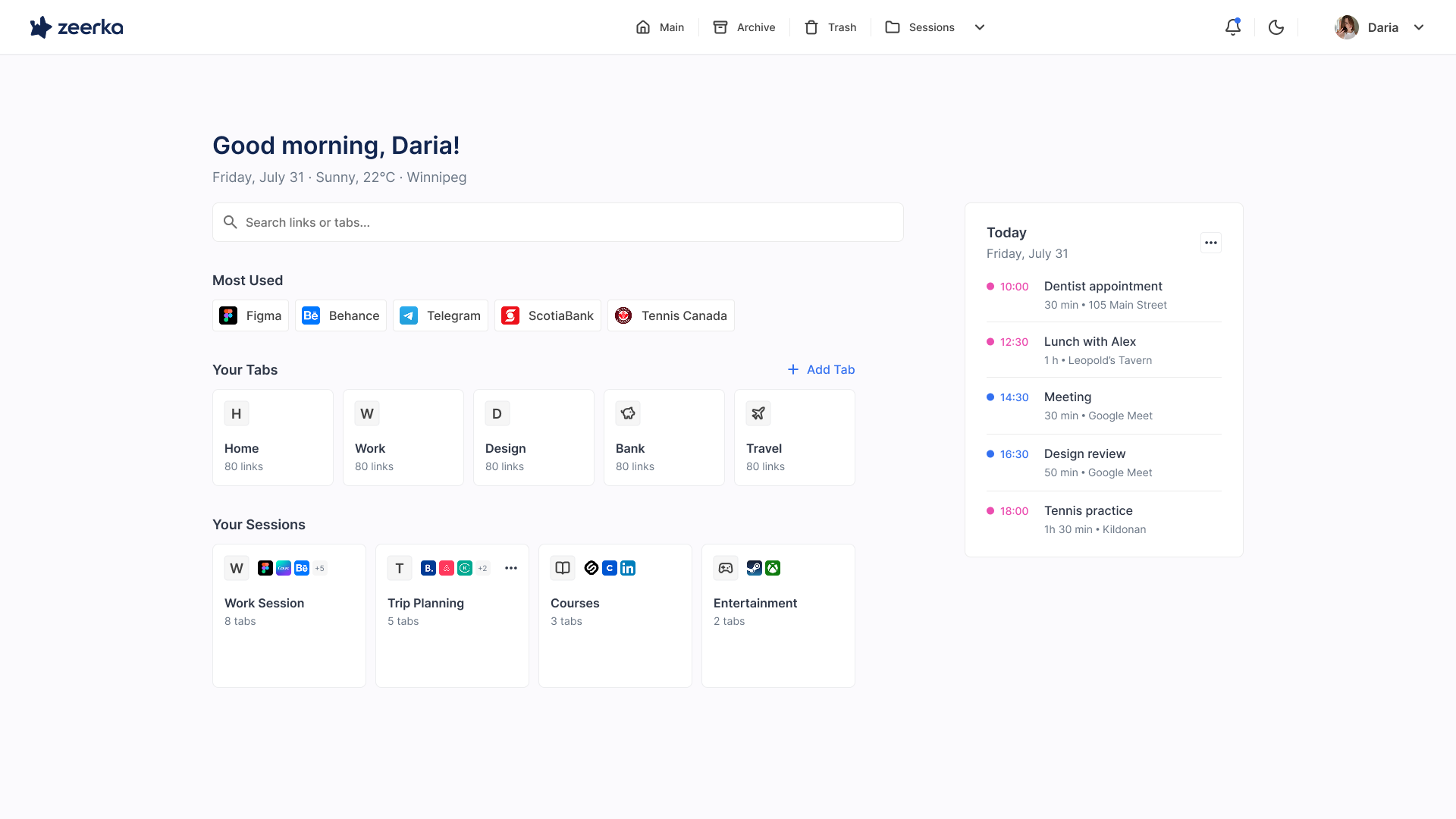
New start page
03
Making plan limits clear
As Zeerka expanded across different plans, some features were only available to specific users.
I designed a clearer system for unavailable and premium features, so users could immediately understand what was included in their current plan and what required an upgrade.
This also created space for new paid features, including calendar functionality as part of the premium offering.
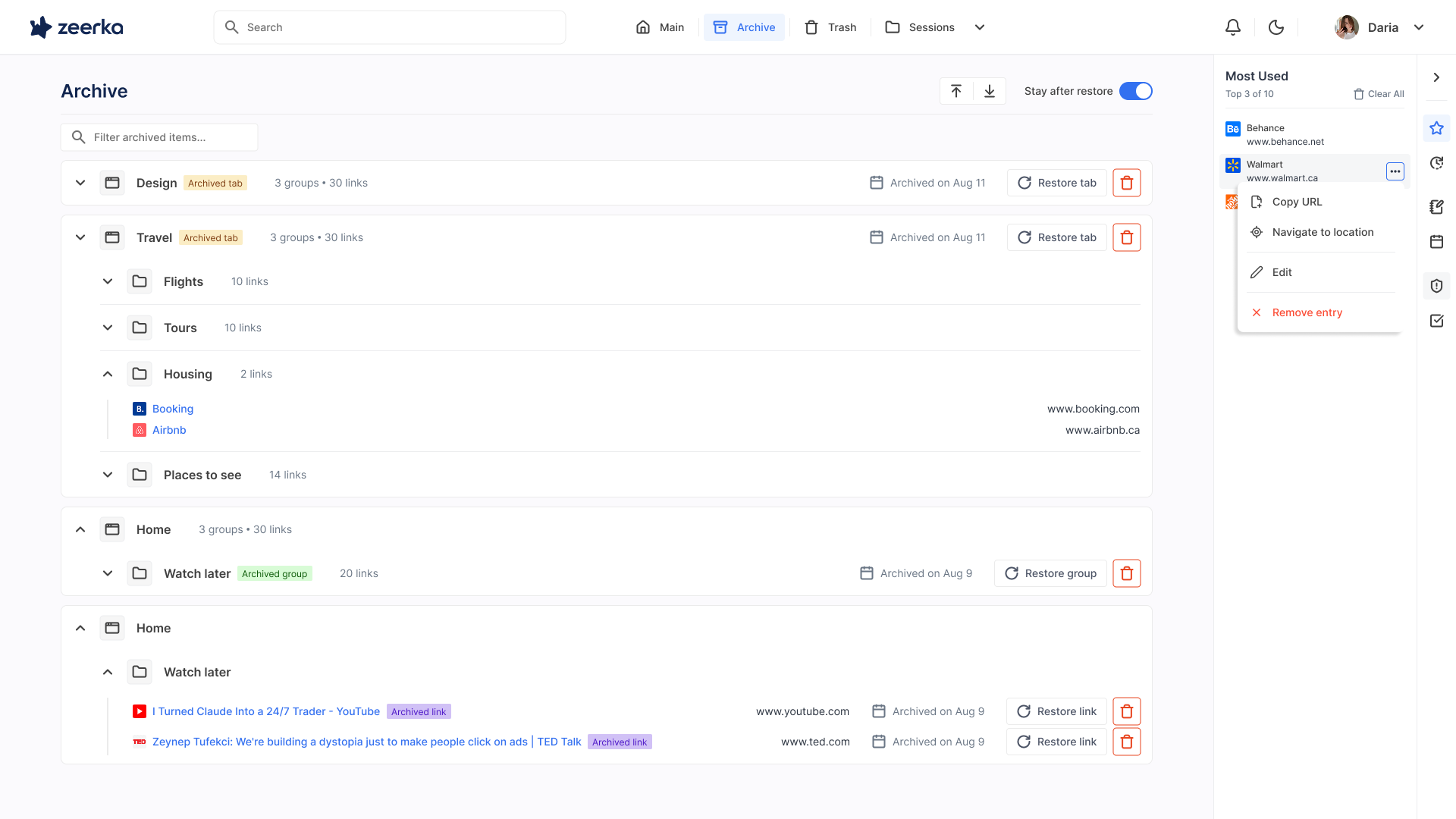
Zeerka archive
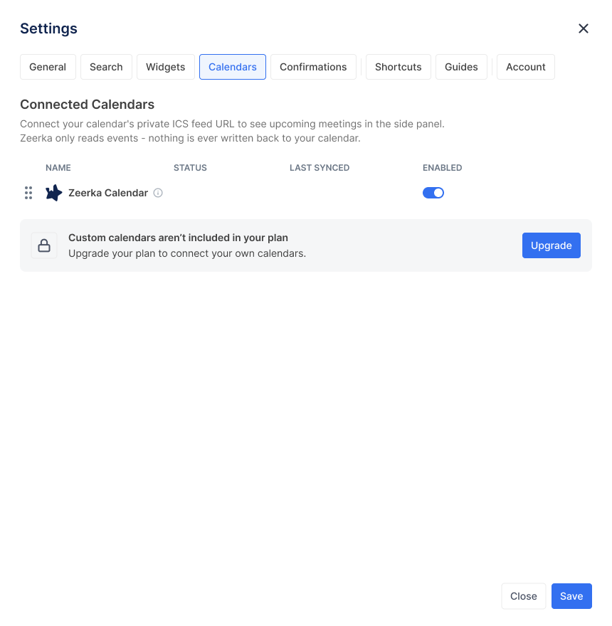
Calendar settings (Starter)
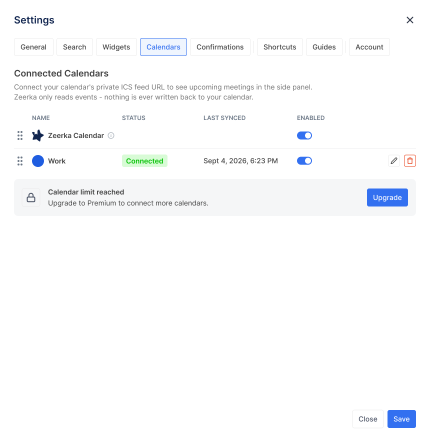
Calendar settings (Standard)
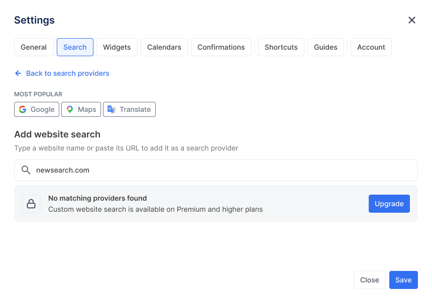
Search settings
04
Simplifying everyday flows
I looked for places where common actions created unnecessary steps or left users with extra work.
Two examples:
Duplicating a session
Previously, duplicating a session created a copy, but the user still had to find it and rename it manually.
I changed the flow so the duplicated session opens directly in Edit Session with the new name selected.
Duplicate → Rename → Continue
Adding a search provider
Previously, adding a new search provider required users to work with a search query / URL pattern, which was unnecessarily technical for a non-technical audience.
I redesigned the flow to make setup more guided and understandable, so users could add a provider without needing to know how query parameters work.
More projects
Take a look at two more projects
If you want to keep exploring, these are two other projects I worked on.