They forget
No pull back into the habit

Case Study 2026
A diary app for writing notes and sending messages to your future self.
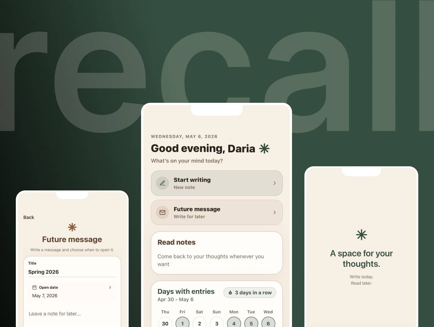
I've always liked journaling — but I kept stopping and coming back to it only occasionally. Notes in my phone didn't feel right, and most apps felt more like trackers than diaries. I wanted something that felt personal. Something I could open a year later and see who I was back then.
That's where the idea came from. A diary for everyday writing — and a way to send a message to your future self, to be opened on a day you choose.
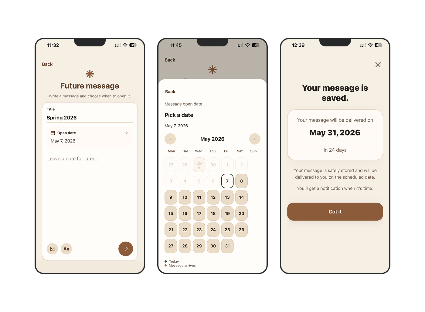
Future message flow
The problem
No pull back into the habit
No progress, no reward
The blank page wins
Research
I spoke with 5–6 people who journal or had tried to. The pattern was the same: people stopped the moment they opened the app and had nothing to say.
"What if I actually want to start writing, but I still don't know what to say?"
That conversation led to two features: Question of the Day for the blank page problem, and an achievement system for motivation. But not everyone wants gamification — so achievements can be turned off in settings. The app shouldn't decide that for you.

A prompt when the blank page wins
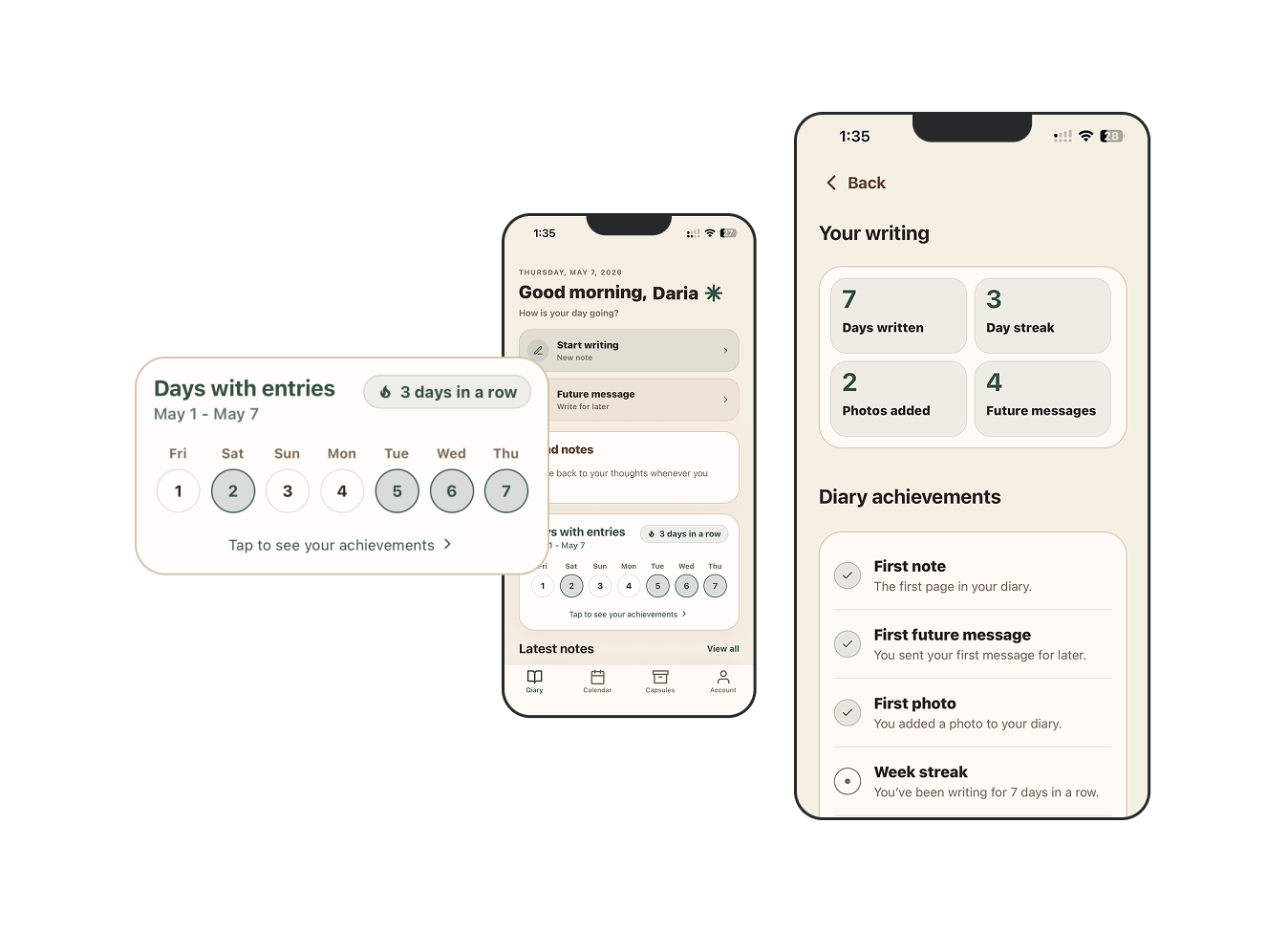
An achievement system - can be turned off in settings
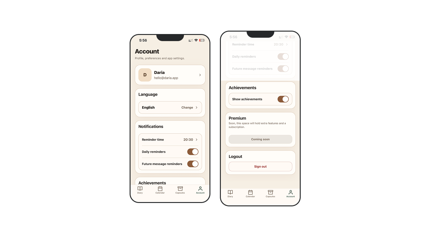
Settings and option to hide achievements
Design decisions
Early sketches included mood tracking, message grouping, and forwarding existing entries as future messages. All three were cut.
The mood tracker made the app feel like a wellness tool, not a diary.
That distinction changed what the app felt like to use, not just what it could do.
Forwarding old entries removed what makes future messages work: the intention. You're writing something now, specifically for a moment ahead. That's what makes it feel like a letter, not an archive.
Visual design
I avoided white backgrounds — the base color is a warm off-white, closer to a book page. Green marks today's entries. Brown marks future messages and their dates on the calendar — something written but not yet opened.
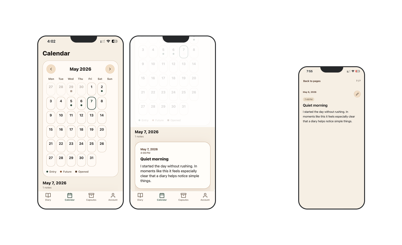
App calendar - green for daily entries, brown for future messages, brown square for opened
Testing
Two rounds — Figma prototype and post-build.
Prototype testing helped identify navigation issues and interactions that didn’t feel intuitive enough.
Post-build testing led to adding notifications and a popup reminding users that a message would be opened today — since this feature wasn’t working correctly before.
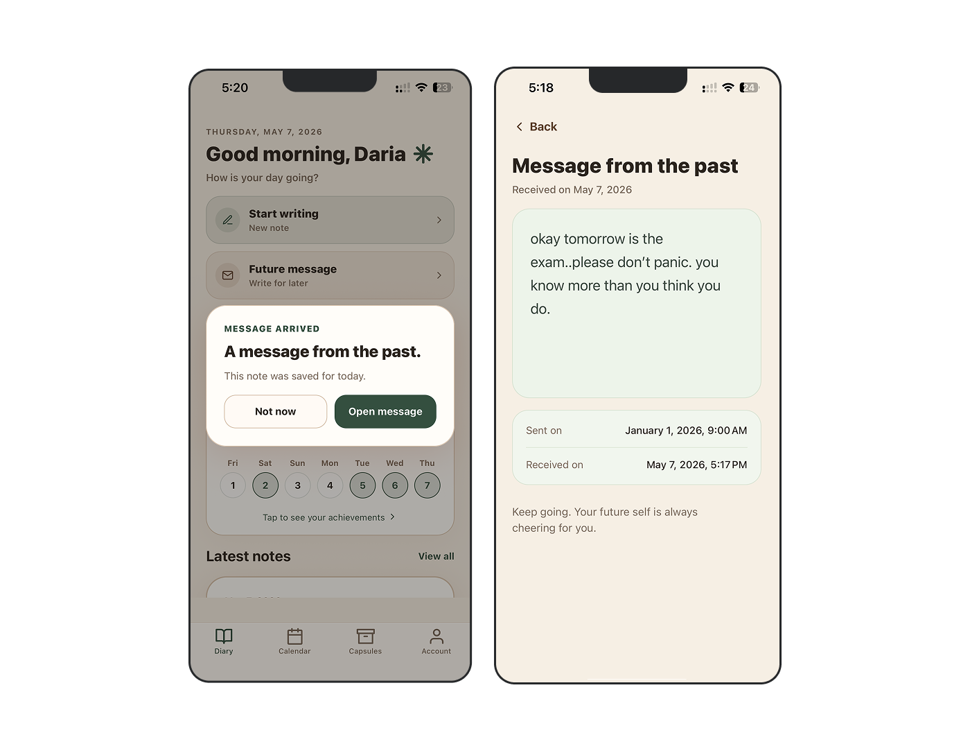
Receiving scheduled messages
Outcomes
Recall is a fully coded iOS app connected to Supabase — currently used by me, friends, and family.
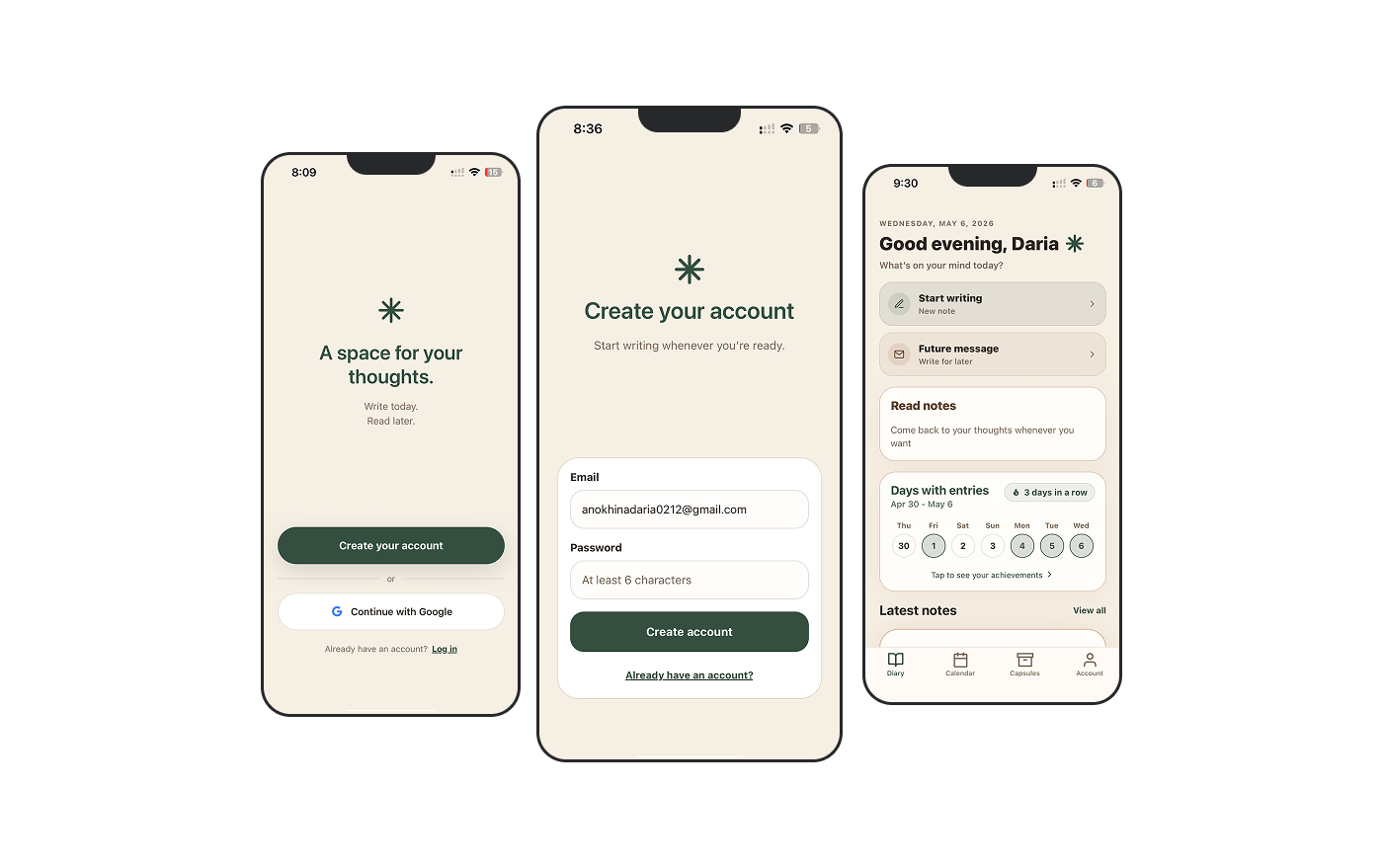
Registration flow
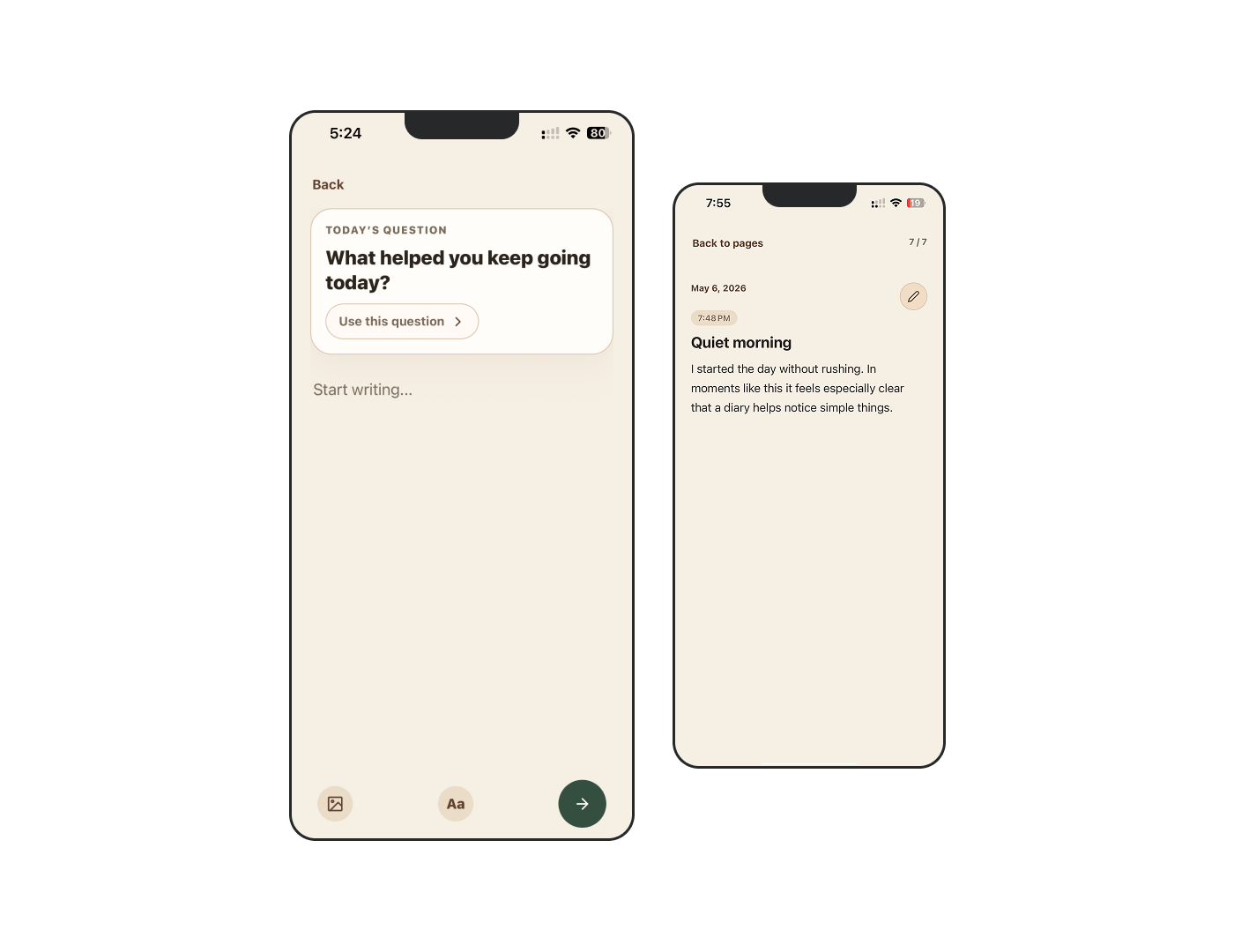
Writing and reading flow
It went from a personal problem to a working product with real users.
An App Store release is the next step.
The final concept feels easy to start and easy to keep using. By focusing on a single daily habit, Recall stays lightweight without losing emotional value.
The interface gives users a clear place to capture thoughts now and revisit them later, which is what makes journaling feel sustainable.
What I learned
Starting with your own problem gives you real empathy — but it makes it harder to let go of features you're attached to.
Building with Codex taught me to describe intent precisely. Vague prompts produced vague results.
Recall is better because of what isn't in it.
More projects
If you want to keep exploring, these are two other projects I worked on.